Jeff Cronenweth, ASC: The cinematography of Tales From the Loop
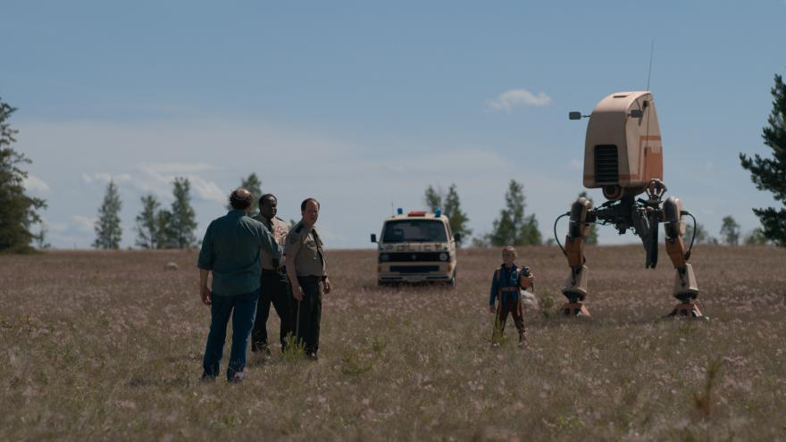
Tales From the Loop, a new eight-episode series now streaming on Amazon Prime Video, explores the goings-on in a small Ohio town situated atop a mysterious machine that has made the stuff of imagination into an everyday reality for the local residents. Based on the paintings of Swedish artist Simon Stålenhag, the series was written by showrunner Nathaniel Halpern, and the pilot episode reteamed director Mark Romanek with longtime collaborator Jeff Cronenweth, ASC.
“Mark’s not one to be shy of using references that he’s fond of,” says Cronenweth, who was still working as a camera operator when he first partnered with the director in the mid-1990s. After stepping up to cinematographer, Cronenweth would continue to shoot music videos and commercials for Romanek, as well as the feature One Hour Photo. As they began to prep the pilot for Tales From the Loop, the cinematographer notes, “Directors like Ingmar Bergman, Andrei Tarkovsky and Krzysztof Kieslowski were all inspirational to us. We reeducated ourselves in their films, their choices of light, and in particular their pacing and camera movement. Tales From the Loop very much has a kind of Scandinavian, methodical storytelling technique.”
The production also reunited Cronenweth with Light Iron supervising colorist Ian Vertovec, with whom he had previously collaborated on a range of projects, including features such as The Social Network, Hitchcock and A Million Little Pieces. “I spoke with Ian right when I got the gig, as soon as the choice was made to go with Light Iron,” the cinematographer says. “I started talking about our approach, how we were going to film, what I thought it would look like, and I gave him some of the same references that Mark and Nathaniel and I had looked at. We talked about the pace and tone and color.”
“We also talked a lot about skin tone, and time of day, and trying to get a sense of period,” adds Vertovec, one of Light Iron’s co-founders. “We didn’t want to hit you over the head with this old-fashioned look, but we really wanted to emphasize nostalgia and timelessness; we wanted the audience to be thinking about their childhood. We were trying to trigger on that emotion, a kind of melancholy nostalgia, and to find the colors that would support that.
“One of the things I noticed in Simon’s paintings was the natural color palette,” Vertovec continues. “It definitely was not a traditional science-fiction color palette; it was much more natural light, end of day, almost a perpetual magic hour. Nothing was too colorful, nothing was too poppy, nothing was too contrasty. It was all very beautiful, and it tied in with what Jeff and Mark were saying. They didn’t really want a ‘look’ applied so much as they wanted the natural vibes to come through, the natural palette.”
The filmmakers also decided early on that they would employ a large-format sensor for Tales From the Loop. “We went with large-format with the idea of giving the show a scale and a scope that’s larger than traditional approaches to television, and also for the lack of depth of field,” Cronenweth explains. “I’m adamant about depth-of-field being one of our storytelling tools, so the audience will be present where we want them to be. Also, there’s a little girl in the show who’s lost in this world, and a shallow depth of field was a great way of keeping her isolated and making the world more confusing and abstract.”
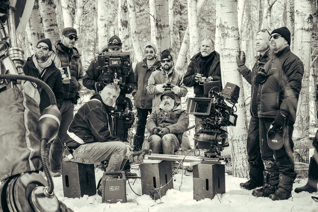
Partnering with Panavision, Cronenweth chose to employ the Millennium DXL2 camera with large-format Panaspeed and Primo 70 primes. “I had used the DXL2 on different jobs in the past, and I was a fan of it already — it’s my go-to camera when I want to utilize Panavision’s world-renowned lens inventory,” the cinematographer explains. Referencing the camera’s 8K imager and native 1600 ISO, he adds, “I liked the idea of the extra resolution and the speed, especially in the case of day exteriors turning into night and some of the sets we were working in. We shot 16:9, which was required by the studio, and for certain visual-effects shots we might have gone to 8K, but for all intents and purposes it was a 6K show.
“When we went through our lens testing and discovered the Panaspeeds, their optical properties just fit our palette perfectly,” he continues. “They’re very sophisticated pieces of glass, but they lend themselves to not being ‘perfect.’ They’re more natural in a way because of their aberrations. It wasn’t a complete set at the time, so we supplemented with the Primo 70s, which fit beautifully. They’re a little cleaner than the Panaspeeds, so we used a little bit of diffusion when we needed it. I felt like if we could shoot our masters and two-shots with the Panaspeeds, it would be easier to match that to a close-up with the Primo 70s.”
For his show LUT, Cronenweth opted to employ the DXL2’s built-in Light Iron Color 2 Film look-up table. Vertovec had been instrumental in developing the DXL system’s original Light Iron Color and subsequent Light Iron Color 2 LUTs. “Jeff took a look at this [Light Iron Color 2 Film] LUT,” Vertovec relates, “and I think he didn’t know that I had been building it off of a lot of the work that he and I had done.”
Once Cronenweth learned of the LUT’s inspiration, the cinematographer says, “It made perfect sense why I would be attracted to it — it’s my own aesthetics wrapped up in a LUT. I like the way the colors roll off, the black levels, the shadow details — I just love the color science in general. The way it interprets color is in line with everything I used to shoot on film.”
Among the LUT’s characteristics, Vertovec explains, “it pulls blues toward more of a cyan, and it pulls greens a little toward yellow, which can make front-lit grass and trees feel more natural, a bit more like film, and not so electronic-looking. We’re shifting the color circle so that it’s not exactly ‘true,’ but that’s cinema: trying to create an artistic impression of how color will render.”
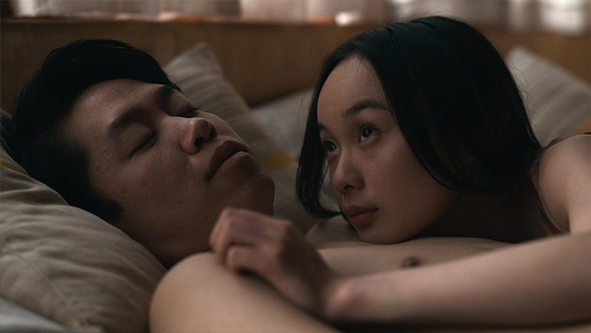
Over the course of the series, the story moves through the seasons, with the pilot set in the winter and subsequent episodes moving through spring and early summer to end just as summer turns to fall. Though the story is set in Ohio, the production made its home in Winnipeg, Manitoba, a location that proved a perfect match in part because “it was flat and nondescript, and the dead of the winter,” Cronenweth notes.
“There was a lot of night stuff written into the script, but we had children in almost every sequence, and rightly so the laws in Canada are pretty strict about children,” he continues. “With that in mind, after scouting and watching the sunset and timing things out, we decided to play all of the night scenes at twilight — we wouldn’t lose our talent, and it lasted long enough that if we planned our shots well and rehearsed beforehand, we could manage to get the coverage done. We’d block out maybe six two-camera setups for a scene, and then we’d motor through in 45 minutes or an hour at most.
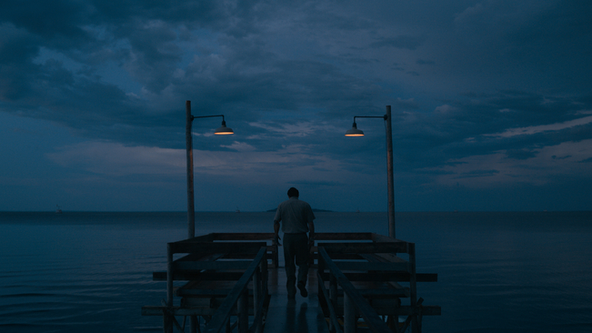
“Also, at twilight we would still have some color separation from the sky to the trees, which gave us depth, especially when we were in big, open places,” he adds. “It gave us so much more detail, and we could really feel the environments. And because you see that repeatedly throughout the show, you buy into the idea that that’s what happens to the sky there — it just stays that color.”
When it came to the final color grade, “We talked a lot about maintaining this perpetual twilight,” Vertovec adds. “The story is set in Ohio, but I think that makes it feel more Scandinavian, where the days can be really long and you get this very interesting day-night cycle. We tried in the grade to get this sense that it was the longest sunset that’s ever existed. It has a little bit of that supernatural, magical quality.”
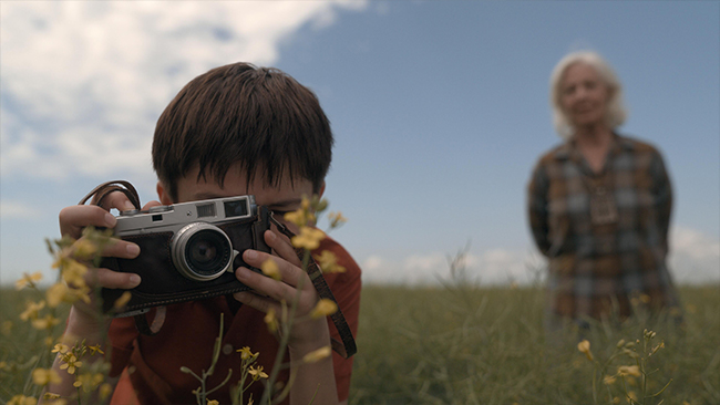
The overriding objective with the grade was to remain consistent with the look the filmmakers had established during production. “It’s a soft look, but rich,” Vertovec describes. “There is contrast, but it’s not a hard contrast.” Grading on a FilmLight Baselight system, Vertovec focused on adding contrast “only in areas of coarse detail, not fine detail,” he says. “If you add too much contrast in something that has very fine, high-frequency detail, that’s where you get that sense that everything’s really sharp. But if you just add contrast in the low-frequency areas, you can have a nice, rich image, but not one that feels too sharp.”
“On a TV schedule, the window for the DI session is more condensed than on a feature,” Cronenweth says, “so I let Ian do the first pass on his own to get things close — and I would have been happy to release it after his first pass. Having done so many films together, we have an understood language.”
Following Cronenweth’s work on the pilot, Ole Bratt Birkeland and CSC members Luc Montpellier and Craig Wrobleski took the reins for the remainder of the season’s cinematography, shooting with the same lenses, camera and show LUT. “Ole and Luc both came to set and watched for a week before they started shooting their own stuff,” Cronenweth says. Laughing, he adds, “It was the first time in my career where I’d come back to look at my monitor and there were two other cinematographers sitting right behind me! They wanted to absorb what we were setting out to do so that they could then lead their own shows down a cohesive path.”
Working with each cinematographer, Vertovec says, “I made sure that there was always a certain consistency in the way it all came together in the grade. I was always asking each cinematographer to tell me what specifically they wanted for their episodes, but then I would cross-reference certain characters who were in other episodes and make sure the skin tone and the palette felt consistent through the whole series.”
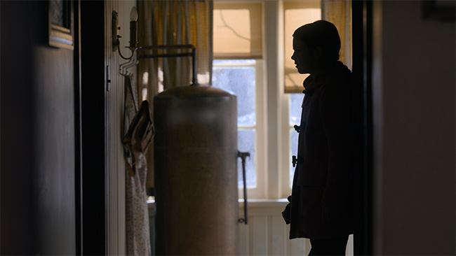
Further helping to ensure a consistent vision, Halpern was involved in the grading of each episode. “Nathaniel wanted to nail this specific feeling of nostalgia,” Vertovec shares. “The color was a big part of that. He was very specific about wanting to make sure that the whole show lived in mid-tones, and that nothing was really black or white — even the snow is a kind of soft off-white, and if there was something very dark, it wouldn’t be black. He was a great asset to have in the grade because he knew exactly what he was looking for.”
Amazon required both an HDR10 and a separate SDR deliverable for Tales From the Loop. However, rather than performing a separate grade for each of the deliverables — an approach that would have required managing two timelines, and incorporating and keeping track of visual effects across both — Vertovec opted for a Dolby Vision workflow, in which the SDR pass is interpolated alongside the HDR grade. “We were working in HDR, and the SDR tracked along with us as we went,” Vertovec explains. “We were mostly paying attention to the HDR, but we were simultaneously monitoring the SDR to make sure it was working. And once we were happy with the HDR, we could turn our attention to the SDR and do very quick and very minimal final adjustments. Because we did both at the same time, we had more time left over to do creative work.”
Cronenweth agrees that by eliminating the time that would have otherwise been spent managing two separate passes, the workflow effectively “extended our time together. It also allowed us to really appreciate the nuances of both versions. It was a great learning curve to see them both at the same time.”
As footage from the series made it to Vertovec, the colorist recalls being consistently “blown away by the environments — they’re just gorgeous. You’ve got huge, dramatic skies, and there are so many areas around Winnipeg where you can see the horizon. It’s flat and big and you really feel the space. It was amazing working in HDR, because we could really maximize the environments.”
Winnipeg, Cronenweth adds, was “a great place. I had a phenomenal crew — they were caring, they were creative, and they contributed massively. They came to play.”