Vital History

With its fourth season, the National Geographic series Genius presents a dual portrait of Martin Luther King Jr. and Malcolm X, inspirational leaders who paved parallel paths as pioneers in the American civil rights movement in the 1950s and ’60s. Genius: MLK/X traces their journeys from their formative years through their rise to prominence, as they each shaped a legacy that remains vitally important.
Trevor Forrest served as lead director of photography for MLK/X, with cinematographer Joe “Jody” Williams lending his talents to select episodes. Forrest worked closely with Panavision to select an equipment package based around Panavised Alexa 35 cameras and Primo spherical lenses, with modified Anamorphic Flare Attachments used for key moments. “Trevor was an early adopter of our Anamorphic Flare Attachments,” says Dan Sasaki, Panavision’s senior vice president of optical engineering and lens strategy. “He used them on Little Fires Everywhere, and when he was prepping MLK/X, he was looking for an even more pronounced anamorphic effect. We ended up modifying the AFA so it would still provide the anamorphic flare and also induce a visually appealing falloff around the edges.”
What follows are Forrest’s reflections on the production, in the cinematographer’s own words.

When I read the scripts for the pilot and first few episodes, I was mostly struck by the scale of the story about the whole lives of these two iconic world figures. I knew that even though this was a biopic, it was a modern thriller at its heart. What brought this scale together was the parallel connection described in the book The Sword and the Shield, which inspired the series.
Looking at the range of years from the mid 1940s to the late 1960s, I initially tried to create an approach to each decade. This quickly shifted to follow the socioeconomic movement of the time. There was pre-war, post-war and then the 1960s, which had its own departure because those years were a very dangerous time for both MLK and Malcolm X as they grew beyond their beginnings and many saw them as threats to the political status quo.
A film stock that charted this exact trajectory was Kodachrome color reversal. It became my base reference and way into creating this world. The specific qualities of reversal are much closer to a digital sensor than the density of a three- or four-strip motion-picture film stock. Reversal is thin and sharp — exacting is another way to say it.
Photographers of the time that ran parallel to this journey and had used Kodachrome were Gordon Parks and Ernst Haas. They were already on the mood wall of director Channing Godfrey People’s office wall when I met her. The archive staff of Life magazine and National Geographic were amazing partners and allowed me to physically dive into the image archive for inspiration. This is how we designed the color palettes of sets and costumes, which were beautifully created by production designer Todd Fjelsted, costume designer Mercedes Cook and their teams.

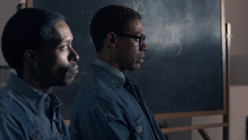
The way we depicted the show’s periods would follow the look of the film stock as it grew over those decades. From 1940-1945, what we called our 'pre-war' era, Kodachrome had bright, natural greens, a muted palette of all the other colors that weren’t yet well developed, cream highlights, and brown and blue shadows rather than black. Our approach to this era was informed by nature — daylight, with candlelight and flashlights at night in the countryside, and very little streetlight in the towns.
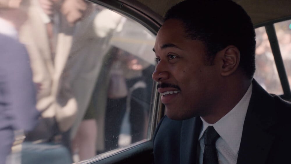
In the post-war years of 1947-1959, film-stock technology rocketed, and Kodachrome became the signature of Life magazine and the photography of the time. Bright, clear colors, skin tones and clothing details were well-defined, and the shadows were now a deep navy blue. The war was over, and we sought to capture the flamboyance and relief with more color, camera movement, and joy expressed through costume and lighting — front-lit flash photography and warm tungsten streetlight and home lighting. We let the shadows fall away to allow the story to be clandestine in Malcolm’s world and to underscore the private drama unraveling in MLK’s life at home and at church.
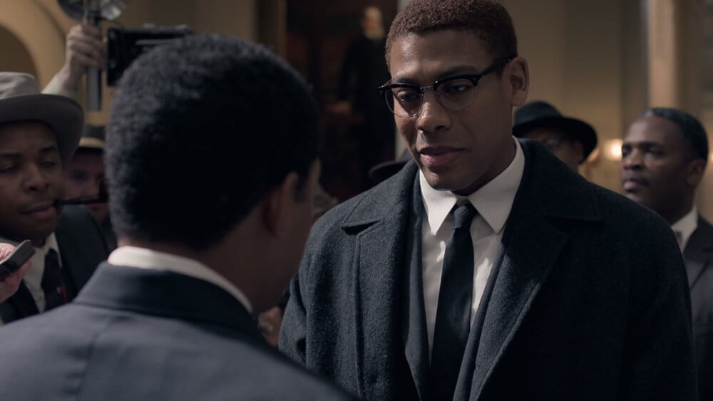
In the 1960s, Kodachrome had its best clarity in the highlights, but the shadows fell off very quickly. Fluorescent lighting worked together with this to create a shadowy world of uncertainty complemented with pin-sharp and easily overexposed cold highlights. This kept the shadows cool, which also added to the fashion, cars and overall style of the time. Things were dark and dangerous, but the decade, and the cinema of the time, had a style to it that was slick and sharp. Noir filmmaking had found another level.

We used Alexa 35 cameras with classic Panavision Primo lenses. We paired the Primos with modified Anamorphic Flare Attachments for signature punctuations throughout the journey — moments that connected MLK or Malcolm X to their past, or out-of-body experiences when the stress and fear became so intense. I’ve used Primos many times, so I know their qualities intimately. I knew they would render the huge range of beautiful skin tones accurately and represent the characters in a way that felt like you could reach out and touch them. Clarity, not sharpness. The perfect combo.
This project was unique because of its continued cultural importance. We had the opportunity to lift the words of these two men into the world of today. I was brought closer to the story by my film family of technicians, like gaffer Justin Dickson, who had lived the story growing up in the Baptist South and shared their very personal experiences, love and emotion for the scripts, which elevated my ability to tell the story. It was one of those shoots that happens a few times in your career. It was a special experience.

Images courtesy of National Geographic and Trevor Forrest.
